Saturday, 14 May 2016

Chosen Font for Campaign


This is the font I have chosen for my whole campaign. It is called Myriad Pro, and has a large variety of styles, as shown above. 

By choosing a font with many styles such as bold, condensed and italic, I will be able to use the same font throughout the whole campaign without it looking exactly the same all the way through, but still can be recognised as the same font. This is a creative way of using a font with many styles, to make the designs more attractive.

Friday, 13 May 2016

Eyesight Posters


I came across these posters online and I very much liked them. As one of my posters is about the consequence of developing short sightedness if a child uses a smartphone constantly, the above posters are very influential to my idea, however they relate to a completely different topic. I will be using the idea of only seeing clearly through the glasses but it will not be a photograph style.

Thursday, 12 May 2016

Final Design Ideas for Campaign

For my campaign I am going to use the research I have found and put it in to practice. I am going to focus on the negative health effects of being addicted to a smartphone, which I have looked at in detail. I am also going to use inspiration from other campaign designs which I have studied in order for mine to be successful.

Here are my final design ideas for each part of my campaign:

A2 Size Poster 1: Within this poster there will be a hand with a smartphone chained to it which is held in front a window where it will be night time. This poster will specify how not getting enough sleep and using a smartphone late at night can impact on learning at school. I think this will be an important aspect to many parents, as a child's education is vital.

A2 Size Poster 2: This poster will highlight the fact that the constant use of a smartphone can affect children's eye sight and they can develop eye conditions such as myopia which is short sightedness It will contain a pair of glasses where it is only clear through the lenses, the rest of the image will be blurry.

A2 Size Poster 3: For this poster, it will emphasise the fact that hunching over a smartphone can permanently damage children's necks and spines. There will be an image with a skeleton with a bent over / hunched back and another skeleton with a straight back. This will highlight the difference between using a smartphone and not using a smartphone too much.

A2 Size Poster 4: This poster is going to show an evolution of a child who uses a smartphone. It will start off with a straight, correctly curved back, and then gradually get worse and more hunched, as well as incorporating the idea of each other poster - with the tiredness and bad eyesight. There will be a more generic sentence on this poster.

Each poster will include my logo, and will be printed on a foamex board for display at the exhibition.

6 Page DL Leaflet: The leaflet will have a front page with a light pastel blue background with the logo on and a brief description of the study this campaign is more. Each page of the leaflet will contain a scale down version of each of the posters. I will have a large quantity of leaflets printed for my exhibition for people to take with them.

Pull Up Banner: This banner will act as a large advertisement for the project itself and the campaign. The logo will be present and also each poster design will be present, as well as a description of the study. The background of this will again be the same blue as the leaflet cover. This will be printed and displayed at my exhibition. 

Story Book: For the story book I will incorporating all aspects of the posters showing the main negative effects I have found through my research. I will write a short fiction story which contains facts about these particular negative effects, with images on one side and the text on the other. The front and back cover will be again blue, and each page of the book will be a bright colour to attract attention. The logo will also be on the front and back cover.

Moving Image Advert: I will be using generic facts within the moving image advert, and not specifying about anything in particular, except filming with glasses as a prop to emphasise this issue through film as I believe it is one of the most likely health implications for a child. I will use the blue background for the introduction, any text present, and the ending. The logo will also be present within the advert.

Wednesday, 11 May 2016

Interview 2

Today I conducted another one to one interview with a parent of 3 daughters. This interviewee based her answers on all 3 of her children as they are all very similar when it comes to their smartphone addictions. I used the same pre-prepared set of questions for this interviewee and I again recorded the interview so that I could go back to it and refresh my mind of the answers. 

Below are the notes I have taken after listening to the recording I took during our interview, which include the main points which were said. By doing 2 interviews I am able to compare the results.


Monday, 9 May 2016

Interview 1

Today I conducted a one to one interview with a parent of 3 children. This interviewee based her answers on her oldest son who is 13 years old. I had pre-prepared a set of questions for my interviewee and I also recorded the interview so that I could go back to it and refresh my mind of the answers. 

Below are the notes I have taken after listening back to the recording and drawing out the main points of feedback. It was very captivating to listen to all of her feedback on my topic.


Wednesday, 4 May 2016

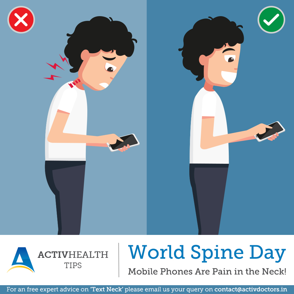
World Spine Day - Poster


Today I came across this poster and I liked it as it is very relevant to my topic of 'Text Neck' and is very influential for my own posters.

This poser represents World Spine Day and this poster specifically specifies how mobile phones are a pain in the neck and causing spine problems.

This poster is very simple however relays the message it is giving in a very creative way - by stating the correct way to stand and use a mobile phone, as well as showing the incorrect way to stand and use a mobile phone.

Sunday, 24 April 2016

NHS Posters


I have looked at a variety of different NHS posters, as I am inspired by the simplicity of them, with the ability to still get an important message across. I like how each of these posters are very brightly coloured and none of them use real life photographs.

This is how I would like my campaign to be. I will be using bright background colours with a series of illustrations that I will be designing. I will have my logo on each poster, just like on the NHS posters, to make sure all viewers know what the poster is for.

I will then have a small amount of text on my posters, like each of these, as too much text is overpowering and I believe that each of the above posters have a great balance of image and text.