This is my moving image advert, which is a vital part of my campaign. This advert does not go in to detail about the particular negative effects which I have looked at thoroughly, as each of my posters explain about the health and educational implications smartphones can cause for children.
Thursday, 19 May 2016
My Moving Image Advert
This is my moving image advert, which is a vital part of my campaign. This advert does not go in to detail about the particular negative effects which I have looked at thoroughly, as each of my posters explain about the health and educational implications smartphones can cause for children.
Tuesday, 17 May 2016
Making of My Moving Image Advert

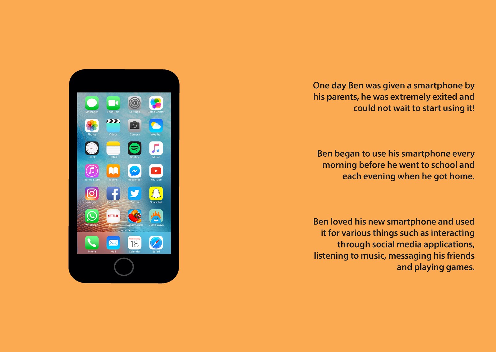
For my moving image advert, I decided to film in a bedroom, using the bed side table, a pair of glasses and an iPhone (smartphone) as props. I used a DSLR camera, a tripod and a light whilst filming my footage.
I filmed in this particular room with these props, to show the audience that the the glasses and phone shown on the bed side table belong to a child. I paired these two items together to show that the smartphone did in fact cause the need for glasses.
I used all close up and extreme close up shots within this sequence as not to give away too much except reveal the idea of how the child was addicted to the phone, however needs glasses to see without blurry vision due to the constant use of the smartphone causing short sightedness.
The glasses and phone are picked up and the phone is being used for a variety of different applications. After this the phone is put back down on the bed side table, but the glasses are not, which shows that the glasses are needed all of the time, not just whilst using the smartphone. The door is then closed with the smartphone still on the bed side table, which gives the impression the child has left the room without the phone.
The above picture shows all of the shots I filmed.


I first used Adobe After Effects to animate my logo for the introduction of the advert. I scaled the body section to get bigger as the video starts, and the head section swipes down from off screen, which then puts the logo together. I thought this would be more appealing and interesting for the audience to watch as it adds a little bit of character to the logo. I used the exact same blue background as the cover of my leaflet and storybook, as well as my pull up banner so that the advert would be recognisable as part of this campaign.
The above images show each stage of the logo moving.


The above images are screen shots of some of the scenes in the edit of my advert. I used Final Cut Pro to edit this. I imported the intro which I had previously created in After Effects, then added the title of the campaign on the right of the logo.
In between some of the moving image shots, I inserted text, using the same blue background colour again as the introduction, and this was to break up the footage and give the audience something to really engage in by having something to read.
I also added a blue tint effect to all of the footage to cool the colours down and fit in with the theme of the blue backgrounds, as the footage was originally very warm and yellow coloured.
The last piece of text in the video says 'Stop the Addiction before it's too late' in red, just like on all of the other elements of the campaign, so that this video would be related back to these, and the whole campaign would be recognised as one - even this moving image advert.
Finally at the end, I inserted the logo again just to refresh the audience's minds of it where it will be easier to remember it and notice it within other parts of the campaign.
I also added in a copyright free soundtrack for backing music which I believe fits in with the shots and style of the video.
Sunday, 15 May 2016
My Pull Up Banner

This is my final pull up banner, which will be printed and placed inside a stand therefore will stand freely at my exhibition.
My Story Book


These are the final pages of my story book, which will be printed in to an A5 size book.
Making of My Story Book


I have used Adobe InDesign to create my storybook as this programme is better for designs with more than one page. For the front and back cover of the story book I have used the same pattern with the blue as I used for the pull up banner, again to make them look more eye catching.
I have used bright colours on each page in the book to stop them looking boring. There are images on the left of each set of pages and text on the right. I created the story based on the research I have done and incorporated all aspects of the rest of the campaign within it e.g. bad eyesight and text neck.
I will be getting 2 copies printed of this story book for my exhibition, so people can read it and interact with my topic in a creative and innovative way.
Making of My Pull Up Banner

For my pull up banner, I used the same blue colour as the leaflet for the background, however also added a pattern to make it a bit more enticing and interesting to look at. Each of my posters are included in the banner as well as the logo, slogan and a description of my project. This banner will be very large and will be placed at my exhibition to advertise my campaign.
Saturday, 14 May 2016
My Leaflet


This is my final leaflet, which will be folded in to 6 sections that it can be opened up and looked at.
Subscribe to:
Comments (Atom)